
Business Card Design: Pearl Paper and Soft Colors Unite
Today I am proud to highlight a beautiful and unique business card design that Dr. Nicci Santana hired me to create and produce. In addition to designing and developing her brand new website, print materials were also designed — including these business cards as well as a flier for an open house. If I may have a moment of your time, I'd love to share with you how I arrived at Dr. Nicci's business card design.


Discovering Who Dr. Nicci Is
In order to create business cards for Dr. Nicci that accurately represented her mental health practice, I first needed to create that brand. Reason being, Dr. Nicci left a group practice that she belonged to in order to open her own private practice. Moving forward, I knew that I needed to gain a deeper understanding of her newfound business. Through some fantastic conversations I learned that Dr. Nicci is a licensed mental health counselor who serves a wide variety of individuals and families. Dr. Nicci discussed the services that she provides, and shared some photos of her office with me. Through this conversation, I learned both how Dr. Nicci helps her clients, as well as the aura that she likes to project.
I must take a moment to say that Dr. Nicci was very supportive in my work by sending me images that she felt a connection to. These images helped me understand the overall vibe and feel that best represented her personality, as well as the tone of the environment she creates. I cannot overstate how much I appreciate her willingness to converse with me. When I have a print design project, if the client is more or less non-communicative it truly ends up hurting the project. The fact that Dr. Nicci was more than willing to speak and share her thoughts with me greatly contributed to the success of this project.
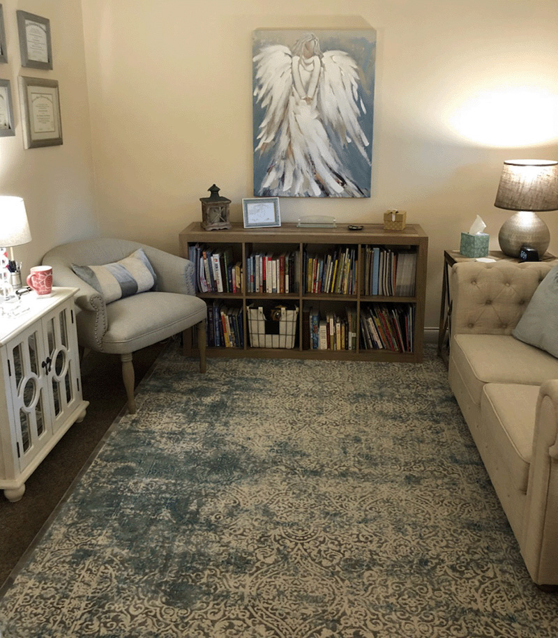
The Creation of a Logo
In the imagery provided, right off the bat I noticed cream tones which were highlighted by calming blues and greens. Two pieces from her office particularly influenced the creation of her brand. The first piece was her rug, which was calming and color-balanced. The second piece was a painting of an angel hanging on the wall. These two items, in combination with the neutral and non-threating colors in her office started to paint a clear picture forward.
Given that Dr. Nicci did not have so much as a logo, I set off to create one for her. As I was also building her a website, the logo would need to work well both in printed and digital forms. Through our conversations I gained insight into her personality. Combining those observations with the color legwork I previously performed, I began to envision a simple, elegant logo. I settled on a typeface that was cursive in nature — I wanted to avoid harsh angles and lines. When choosing a typeface, it's imperative that it's readable. Especially for a logo! With the wordmark-style logo cemented, I turned my attention back to her business cards.
Designing the Business Card
My first step in designing Dr. Nicci's business card was to consider the different mediums — paper, in this case — that may be employed. While most business cards are some form of laminated card stock (boring), there are truly a plethora of options out there. I first considered a linen card stock with aluminum foil accents to play off the soft vibes of Dr. Nicci's personality. With a little more thinking, I decided that aluminum foil inset on a linen card may be a bit too flashy (literally) for this particular project. I was also unhappy with the stark contrast between the soft, muted linen and the shiny, ostentatious aluminum.

Continuing to review my options, my mind darted back to the wedding invitations that I designed for my wife's and my wedding. That was it! Pearl metallic paper would be a great choice for Dr. Nicci. This particular type of card stock, with it's beautiful sheen and unique feel, would fit perfectly with Dr. Nicci's style. Now the challenge was to pair the color direction I had envisioned with the off-white color of the pearl metallic paper.
As any good print designer knows, understanding the medium upon which artwork is to be printed is very important. Given the shimmer of the chosen card stock, I knew that soft colors would need to be dark enough to ensure legibility in both bright and dimly-lit environments. With a little bit of testing and pseudo-math, I fully flushed out the color palette, being sure to carefully consider how the final colors would appear digitally (RGB) and printed (CMYK). What resulted was a tremendously successful print project and cards that have already received quite a few positive comments.
Congratulations on your new cards — and new business — Dr. Nicci!